Designing UX for a Prominent B2B Fintech SaaS Platform
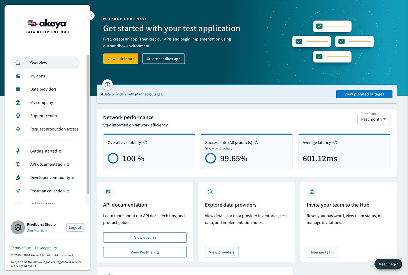
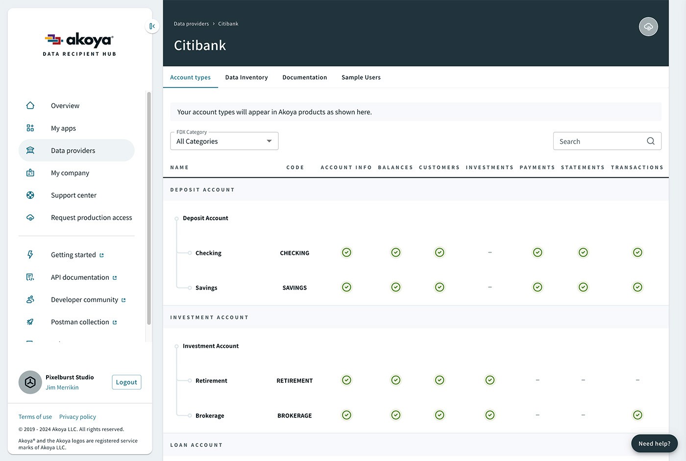
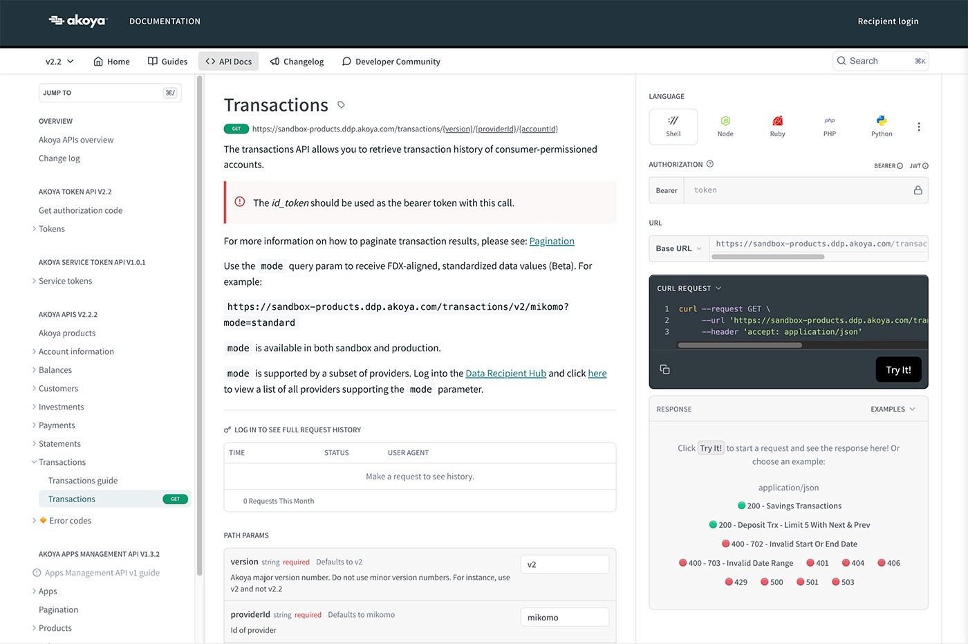
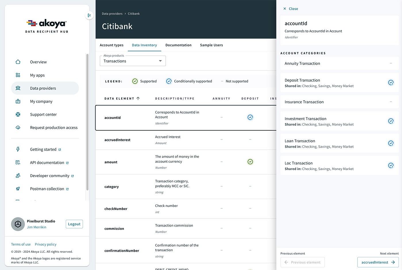
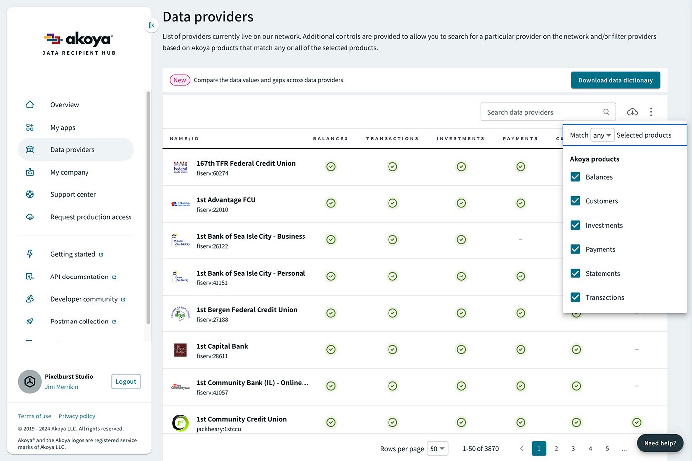
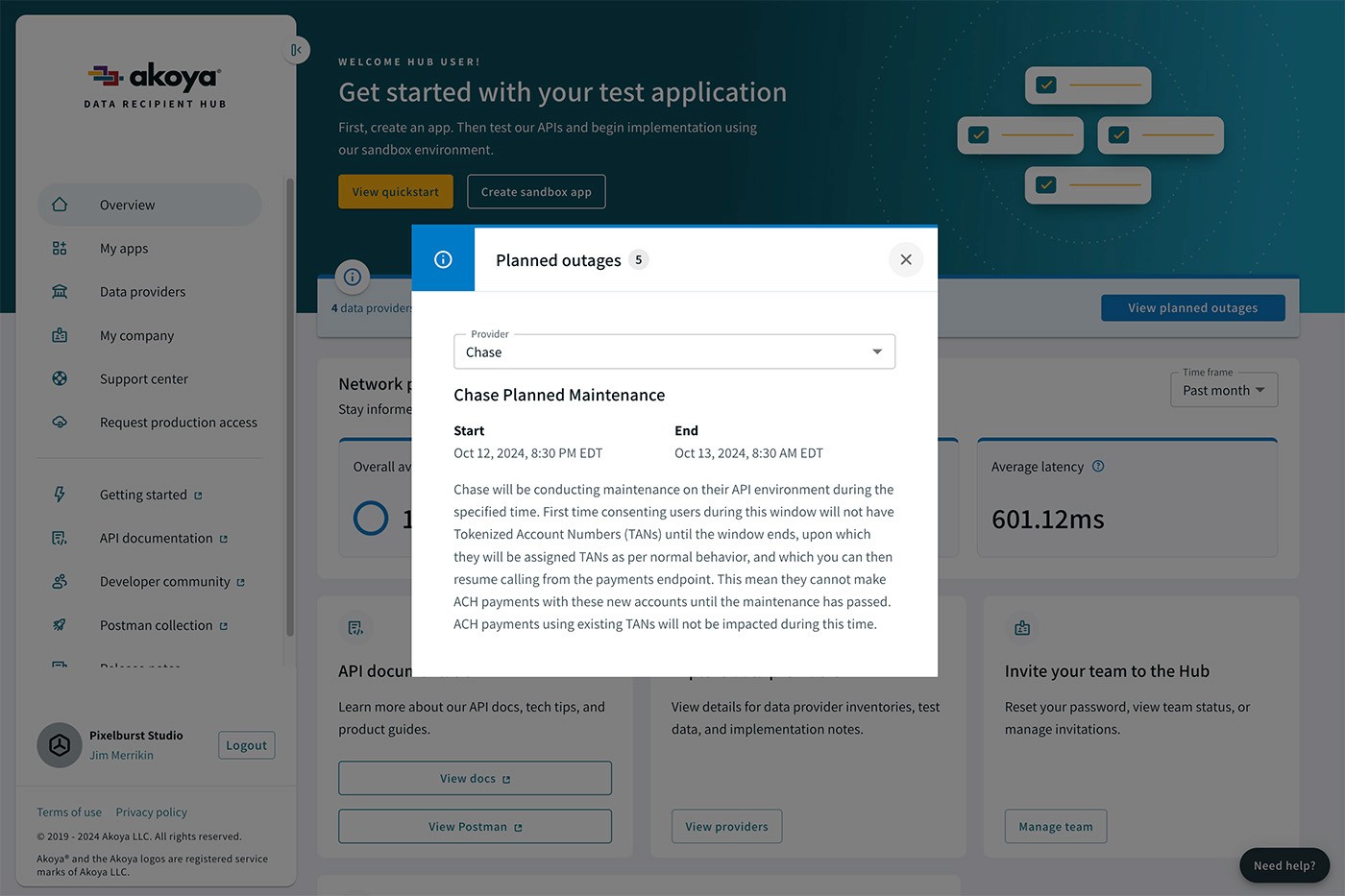
As a data aggregator sitting in between financial institutions and fintechs, the goal was to create an intuitive interface that would facilitate an API-only connection and management thereof.
Challenge
In order for fintech applications to provide value to their consumers, they need a secure and transparent way to access permission-based consumer financial data. Prior to Akoya, aggregators would often rely on screen scraping which had a dependency on using a consumer's login credentials. This method propagated those credentials to servers other than the consumer's financial institution which represents a security risk. In addition, third-party aggregators often store and monetize consumer data without the consumer knowing.
The catalyst to tackle this issue was prevalent in many major financial institutions but it was Fidelity Investments that incubated this startup to solve the problem.
Solving this problem required the design of a complete and robust API-based pass-through ecosystem. The challenge was to develop not only the relationships and APIs that were required, but the creation of an intuitive user interface that would allow parties within the ecosystem to manage those connections along with each respective set of preferences.
Results
In 2020, Akoya was spun out of Fidelity and is now owned by 12 of the largest financial institutions in North America. Since that time, interest and user engagement continue to increase along with enhanced transparency and data security. While the CSAT and NPS scores are not public information, for a startup they are very respectable.
3,780
Financial institutions signed
6
Fintech use cases supported
6
Major product APIs
Process
Research & Analysis: We conducted user interviews, surveys, and analyzed in-app analytics to understand the pain points and user needs. We also studied competitor apps and industry trends to gather insights
Information Architecture: Based on the research findings, we structured the app's navigation and content, prioritizing features and information according to user needs.
Wireframing & Prototyping: We designed low-fidelity wireframes to visualize the layouts and navigation, iteratively refining them based on user feedback, roadmap priorities, and engineering feasibility. Afterward, we built high-fidelity, interactive prototypes to share and test the designs with stakeholders and prospects.
Usability Testing: We conducted usability tests with a diverse group of users to validate the design and identify areas for improvement. Based on the feedback, we made necessary adjustments to the design.
Visual Design & Style Guide: We developed a cohesive visual language resulting in a branded design system based off of Material UI. This includes color schemes, typography, and iconography, ensuring consistency throughout the app. We also created a style guide to maintain design consistency in future updates.
“ Reimagining and redesigning the process for requesting and receiving data on the Akoya network adds value across the entire ecosystem. ”

Ryan Magalhaes
Product Designer | Akoya
Conclusion
The modernization of the consumer financial data access platform successfully addressed the core issues within the industry and improved the overall user experience. By focusing on providing an API-based network with intuitive developer portals and optimal workflows, Akoya was able to create a more efficient and streamlined platform for fintech users and financial institutions. The continued adoption of the Akoya network is proof that user engagement and satisfaction are improving with each release as the company matures and achieves business success.
